

Newtons Brand Identity Redesign Spotlights Real Fig Filling
Quick Summary
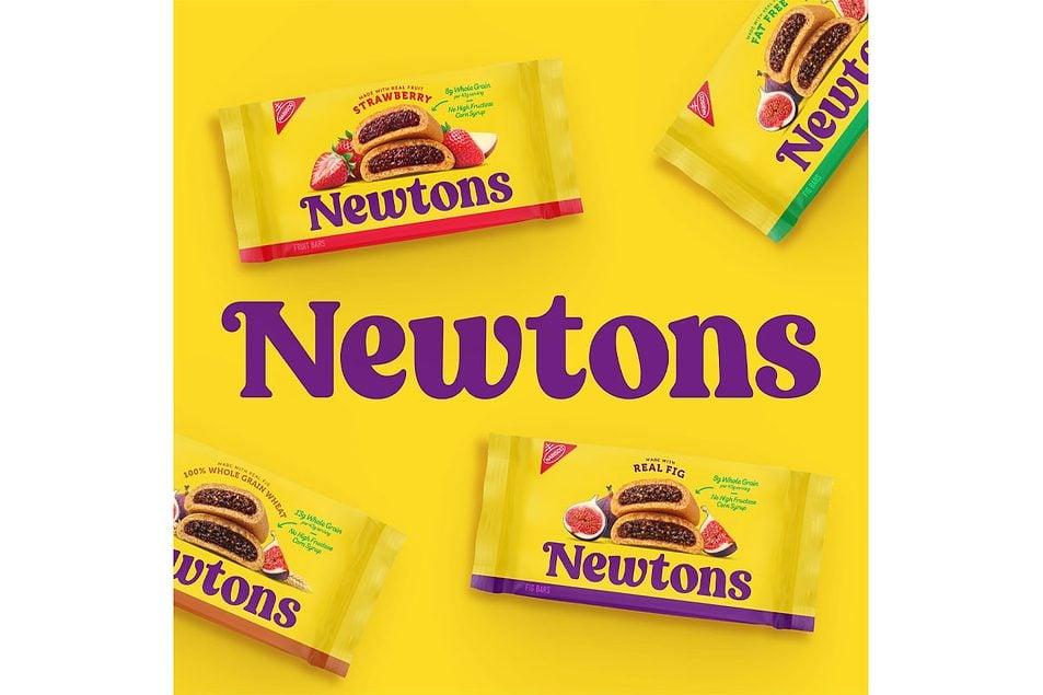
Mondelez International officially launched a vibrant, contemporary brand identity redesign for its historic Newtons product line to capture modern consumer demographics. The bold visual overhaul successfully introduces larger typography, sharpened package graphics, and highly vivid real fruit imagery nationwide.
Crucially, the marketing team purposefully retained the signature bright yellow package color to maintain instant brand recognition among longtime fans. This strategic retail transformation highlights a brand-new promotional tagline emphasizing the use of authentic fig filling inside every bar. The comprehensive design update applies seamlessly across all classic flavor varieties on grocery shelves to bridge traditional heritage with evolving market standards.
Introduction
Legacy brands must evolve continuously to capture the attention of today’s changing consumer market. Therefore, Mondelez International is strategically revitalizing its classic product lines for modern audiences. The food giant recognizes that younger shoppers seek both nostalgia and authentic ingredients. This timely brand refresh blends historical identity with bold, contemporary design elements.
Newtons Brand Identity Redesign Hits Retail Shelves
The century-old cookie brand now features bolder typography alongside vastly sharpened package graphics. The company proudly highlights a brand-new tagline on the wrapper. This strategic label boldly reads “made with real fig” to attract health-conscious consumers. Therefore, the prominent text quickly differentiates the chewy bar from competing snacks.
Packaging Evolution Preserves Iconic Yellow Color
Crucially, the brand manager carefully retained the signature bright yellow packaging color. Recent consumer research clearly proved that shoppers hold a strong connection to this hue. However, the new layout highlights an enlarged, vivid image of the rectangular treat. This imagery showcases the famous soft-baked texture quite beautifully.
Modern Graphics Connect Heritage With Younger Audiences
Additionally, beautiful illustrations of fresh, real figs decorate the clean wrapper. This artistic choice reminds buyers of the rich, authentic fruit flavor inside. Company leaders spent significant time testing various designs before picking this final look. The refresh celebrates deep heritage while exciting an entirely new fanbase.
Strategic Product Differentiation Drives Modern Retail Marketing
Brand leaders designed this specific layout to highlight the fruit filling. Thus, the visual shift positions the product as a premium snack choice. Consumers increasingly demand transparency regarding ingredients in their favorite baked goods. This crisp artwork serves as a direct answer to consumer preferences.
Classic Cookie Varieties Transition To Updated Market Standards
The exciting design update applies universally across the entire product lineup. Therefore, fans can spot the new look on strawberry and fat-free versions. Whole grain varieties also display the bright, clean graphics on grocery shelves. This uniform rollout ensures strong brand continuity during the major retail transition.
FAQs
What specific changes did Mondelez introduce during this Newtons packaging refresh?
The corporate team introduced much larger typography, highly vivid product imagery, and sharper background graphics. They also added a distinct “made with real fig” tagline directly to the front label.
Why did the brand managers choose to keep the traditional bright yellow package color?
Extensive consumer testing and market research revealed a powerful emotional connection to the classic color. Shoppers recognize the product instantly on shelves because of this iconic, historical yellow branding.
Which specific Newtons product varieties will feature the brand-new modern look?
The striking modern design covers the classic fig bars and the popular strawberry flavor. Additionally, health-conscious shoppers will find the update on fat-free and whole grain packages.
When can consumers expect to see these redesigned snack packs in local grocery stores?
The national product rollout officially began hitting major retail shelves during May. Consumers across the entire country can expect a steady arrival of fresh inventory weekly.
What core marketing objective drove the development of this major visual redesign?
Mondelez actively seeks to introduce the 130-year-old heritage brand to a younger generation of snackers. The bold visuals aim to capture the attention of modern, health-conscious consumers.
Key Takeaways
- Mondelez modernizes the iconic Newtons packaging to attract a younger shopper demographic effectively.
- The extensive visual redesign features much larger typography alongside incredibly sharp graphics.
- The classic yellow wrapper remains unchanged to ensure immediate, effortless brand recognition on shelves.
- Vibrant real fruit imagery emphasizes authentic, high-quality ingredients to satisfy modern consumer preferences.
Conclusion
In conclusion, this creative packaging update beautifully bridges traditional heritage with modern consumer trends. Newtons successfully highlights its authentic fruit ingredients to capture a brand-new generation. As a result, the beloved snack stands out brightly on modern grocery shelves.
